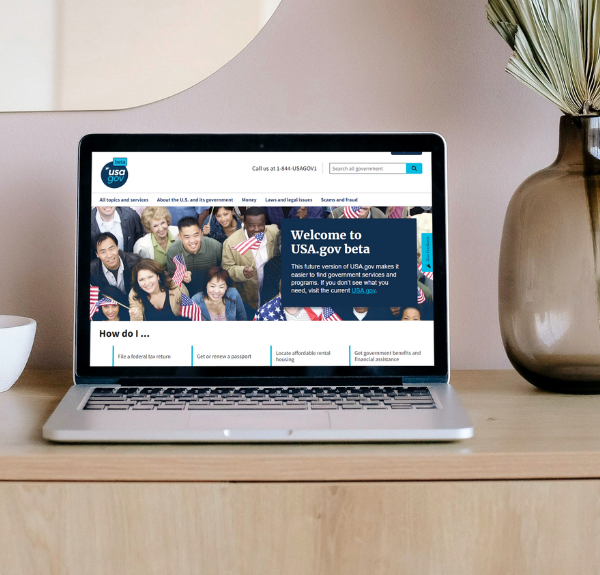
The Biden-Harris Management Agenda Vision (PMA) lays the foundation for an effective, equitable, and accountable government that delivers results for all Americans through three main priority areas. Periodically we share stories that highlight real world examples of one of the three PMA priorities. Follow along as we discuss the current approach of the USAGov team and what’s on the horizon for the USAGov website. Learn how this site improves the customer experience for Americans and supports the work of Priority Two of the PMA.
People often come to USA.gov and USAGov en Español when they need information about the Federal Government but don’t know where to start. In FY 2021, the sites connected people with government information more than 84 million times. As part of its work under the PMA and the Executive Order on CX, the team leading USA.gov and USAGov en Español has been working to position the federal front door to better meet the needs of the customers it serves. By using website analytic data, call center data, and qualitative data directly from users, the team has been able to center user experience to completely revamp both the content and the supporting technology of its website and better and more directly meet the needs of its customers. This fall, the team will be releasing the new beta sites to showcase this work and will be asking users for feedback to help measure success.
Here are three things that are the foundation of how they approach their work:
Using surveys and contact center and website analytics to provide the public with a better experience
The USA.gov and USAGov en Español team maintains a robust practice of using both quantitative data, like website analytics and qualitative data, like survey responses or usability testing to inform their work.
When the USAGov team applied these tactics and read survey responses from users, they were able to identify potential points of confusion. One area that they worked to address was making important, actionable links easier to find and more noticeable for users. This included not just moving them up on the page, but also leveraging buttons from the U.S. Web Design System to make these calls to action more easily visible and recognizable so users don’t waste time trying to find the link they need.
Designing Spanish-language content to meet user needs
USAGov has always aimed to understand the unique needs of its user groups. As part of this long-standing effort, USAGov maintains both an English-language and a Spanish-language digital presence, both of which will receive updates and improvements during the beta launch. Importantly, during USAGov’s extensive research and user testing, its user experience team found that the needs of Spanish-speaking users sometimes differed from the needs of English-speaking users. This means that the USAGov en Español interface is not just a direct translation of the English content. Instead, the team has designed its Spanish-language website to best meet the needs of its Spanish-speaking audience. Taking the time to understand and better serve its diverse audiences also contributes to the federal priorities of accessibility and inclusion.
Connections to government benefits and services
USA.gov and USAGov en Español are often the first stop for people who are looking for government assistance but don’t quite know what programs they may qualify for, which agencies administer these programs, or how to apply for programs for which they may be eligible. To help this effort, the team will experiment with different ways of delivering information and services to learn more about how real-life people navigating life experiences leverage both USA.gov and USAGov en Español. These experiments will provide insights that will help USAGov deliver a more streamlined and easier to navigate experience for users.
Lessons learned
Centering customer voice and user experience is a continuous process. USAGov leaders pointed to several lessons learned that may benefit other agencies interested in taking a similar approach:
- Use both qualitative and quantitative analytics: Qualitative and quantitative data have far more power when combined than they do when used separately. Combining insights from both types of data allows a deeper understanding of users’ needs as well as better monitoring for the way that users’ needs change over time.
- Plan for continuous discovery and delivery: Rather than thinking of web redesign as a ‘one and done’ activity, USAGov leaders noted the need to continuously keep a pulse on their users’ needs and adjust web content and features accordingly. For example, leaders discussed featuring tax content more prominently during tax season, where user data showed visitors to the site were primarily looking for information about filing and tracking their tax returns.
- Integrate content, UX and technical design: Integrating and empowering technologists, UX researchers and content strategists has allowed the USAGov team to be nimble and make quick changes in a continuously changing environment.
What’s next
Users can expect to see these and other changes go live on USA.gov and USAGov en Español’s new beta site. To learn more about this program, visit the USA.gov blog. To learn more about other exciting work happening under the President’s Management Agenda, visit the Performance.gov blog.


